Creative Digital Services


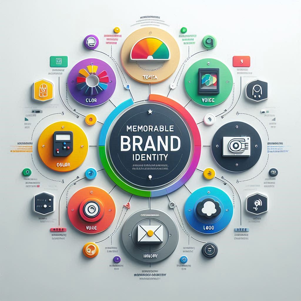
You see a great logo everywhere: the golden arches, the swoosh, the bitten apple. But what makes these brands truly iconic? It’s not just the logo. It’s the entire universe of feelings, messages, and experiences they create.
A logo is the cornerstone, but building a truly memorable brand identity is the entire structure built upon it. It’s the consistent, strategic application of visual and verbal elements that makes your business recognizable, trustworthy, and unforgettable.
In today’s crowded market, a strong brand identity isn’t a luxury; it’s a necessity. It’s the difference between being a one-time purchase and becoming a lifelong customer choice. Let’s break down the five essential elements you need to build a brand that truly resonates.
1. Color Palette: The Psychology of Perception
Color is the first thing your brain processes. It’s a silent but powerful communicator that can evoke emotion, convey meaning, and influence decisions. Your color palette is a foundational step in creating a memorable brand identity that resonates with your target audience.
- Primary Colors: These are the core colors that represent your brand’s personality. Are you a trustworthy blue, an energetic red, or an eco-friendly green?
- Secondary Colors: These complement your primary colors and are used for accents, calls to action, and other design elements to create visual interest.
- Neutral Colors: Your whites, grays, and blacks provide balance and are essential for text and backgrounds.
Pro Tip: Don’t just pick colors you like. Research color psychology to ensure your palette aligns with the emotions you want to evoke in your ideal customer. For a deeper dive, resources like Canva’s Color Meanings can be a great starting point.
2. Typography: The Voice of Your Brand
If color is the emotion, typography is the tone of voice. The fonts you choose, your typography, are a critical component of a memorable brand identity and speak volumes about your brand’s personality before a single word is read.
- Brand Fonts: Choose 2-3 complementary fonts. A classic combination is a decorative font for headings (to grab attention) and a clean, highly readable font for body text (for communication).
- Hierarchy: Establish clear guidelines for using these fonts. How are headings, subheadings, and body text styled? Consistency is key to creating a polished, professional look.
- Licensing: Ensure you have the proper commercial license for any fonts you use on your website and in your marketing materials.
3. Imagery & Photography Style: A Picture of Consistency
The images you use are a critical part of your brand identity and a powerful tool for reinforcing a memorable brand identity at every touchpoint. They should feel like they all come from the same world.
- Style Guide: Define a clear style. Will you use product photos on a clean white background? Authentic lifestyle shots of people using your product? Custom illustrations?
- Filters & Editing: Create a consistent editing style. Whether it’s bright and airy or dark and moody, stick to it. This creates a cohesive visual language across all platforms.
- Iconography: Use a consistent set of icons for things like contact information, social media links, and features. This small detail adds a layer of professionalism.
4. Voice and Tone: How You Speak
Your brand’s voice is its personality. Is it witty and playful? Authoritative and professional? Inspiring and aspirational? Your tone is how that personality is applied in different situations.
- Define Your Voice: Write down 3-5 adjectives that describe your brand’s voice (e.g., “Knowledgeable, Friendly, Encouraging”).
- Create a Glossary: Do you use “clients” or “partners”? “Website” or “site”? A simple glossary ensures consistency for anyone writing for your brand.
- Apply It Everywhere: Your voice should be consistent in your website copy, social media captions, email newsletters, and even customer service responses.
5. Brand Application: The Rulebook for Consistency
This is the element that brings everything together. A brand application guide (or brand style guide) is a rulebook that ensures your brand identity is applied correctly and consistently, no matter who is creating the content.
It typically includes:
- Logo usage rules (clear space, minimum size, and color variations).
- Color palette codes (HEX, RGB, CMYK).
- Typography guidelines (fonts, sizes, hierarchy).
- Imagery and iconography examples.
- Voice and tone guidelines.
This guide is your single source of truth. It’s what prevents your brand from becoming diluted and ensures that every customer touchpoint, from your business card to your website, feels cohesive and professional. This is what transforms a simple logo into a truly memorable brand identity.
Ready to Build an Unforgettable Brand Identity?
Building a comprehensive brand identity is a strategic process that requires expertise and a keen eye for detail. It’s about more than just looking good; it’s about creating a system that connects with your audience and drives your business forward.
At Riz Dziner, we don’t just design logos; we build complete brand identities that tell your story and set you apart. Our Brand Identity & Graphic Design service is dedicated to crafting every element we’ve discussed.